Statistics
If you have a premium subscription you can get statistics on all your assets and trades.
Click on the Statistic > Graph page on the left sidebar to go to your statistics page.
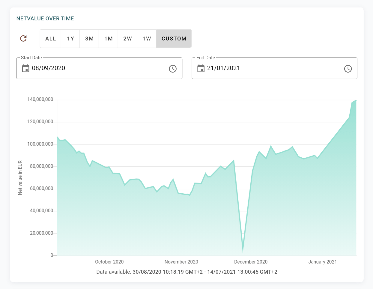
Net value over time
Since rotki is tracking all your assets over time the first thing you can see is a value/time graph of your entire net value.
NOTE
This graph shows your data from the day you first used the app, as rotki takes daily snapshots. In the future, we plan to show older data using historical events, where possible (see this issue).
Following that you can see a graph of quantity of an asset superimposed on its USD value over time.
Asset amount and value over time
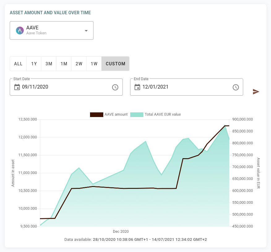
We have introduced an option in the asset graphs to select the Missing snapshot multiplier. It sets after how many hours between two snapshots the graph will display zero balances. This allows to improve graphs for periods where the balance of an asset was zero.
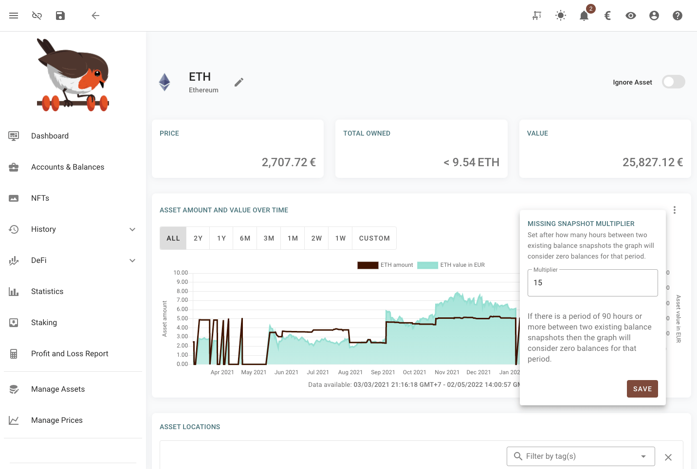
All the assets graphs as well as the dashboard graph have the possibility of selecting a range for zooming. This can be done by left clicking and dragging on the graph itself or using the selector under the graph. The graph can be zoomed out by double clicking on it.
Use historical events and prices
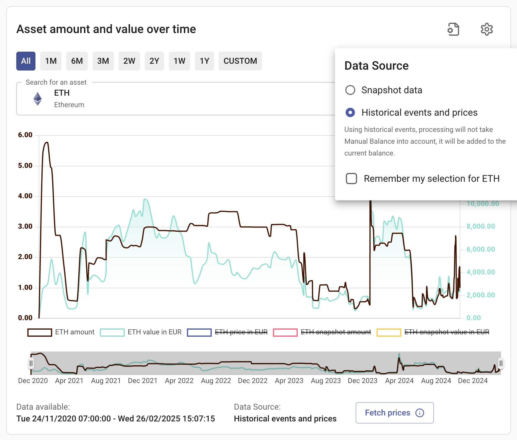
By default, the asset amount and value use snapshot data, which is typically taken daily (depends on the setting). If you want to view more detailed data, you can use Historical events and prices. If you haven't fetched the prices before, some points might be hidden. You can click Fetch prices, and rotki will attempt to fetch the prices and also populate the graph with daily prices, allowing you to observe price movements over time.
Additionally, you can Remember your selection for each asset. So when you reopen the graph for the asset, it will remember the source.
Compare "historical events and prices" and "snapshot" data.
You can show both sources at the same time to compare the data directly:
- You need to select "Historical events and prices" as the source.
- By default, the snapshot data is hidden in this graph. You need to enable it by clicking the legend on the button. (Clicking on the legend will toggle the corresponding line on the chart.)

Mismatch between amount from historical events and current balance
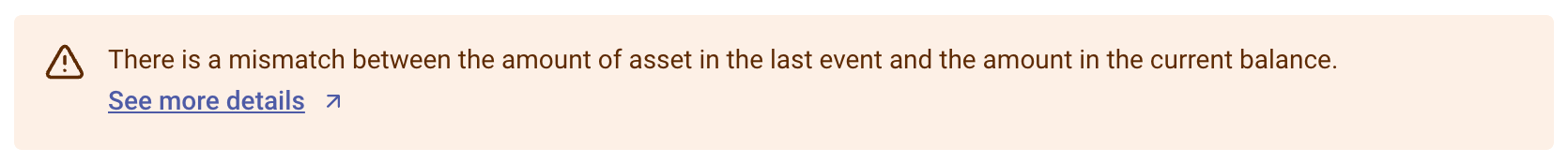
Sometimes you might see this warning, if there is mismatch between amount at the last event with amount in current balance. Here are the possible reasons:
- The history events or the balances haven't fully loaded. If this is the case, you need to wait until all sources are queried.
- You have a manual balance that increases the amount, but you haven't specified the custom event to acquire the asset. Conversely, you have custom events (e.g., from a CSV import), but you haven't specified the manual balance.
- The asset is accruing value in staking or defi LPing but there is no event yet for this accrual.
- Some of your events are not properly decoded by rotki, or there may be missing events or there may be mistakes in the custom events you created.
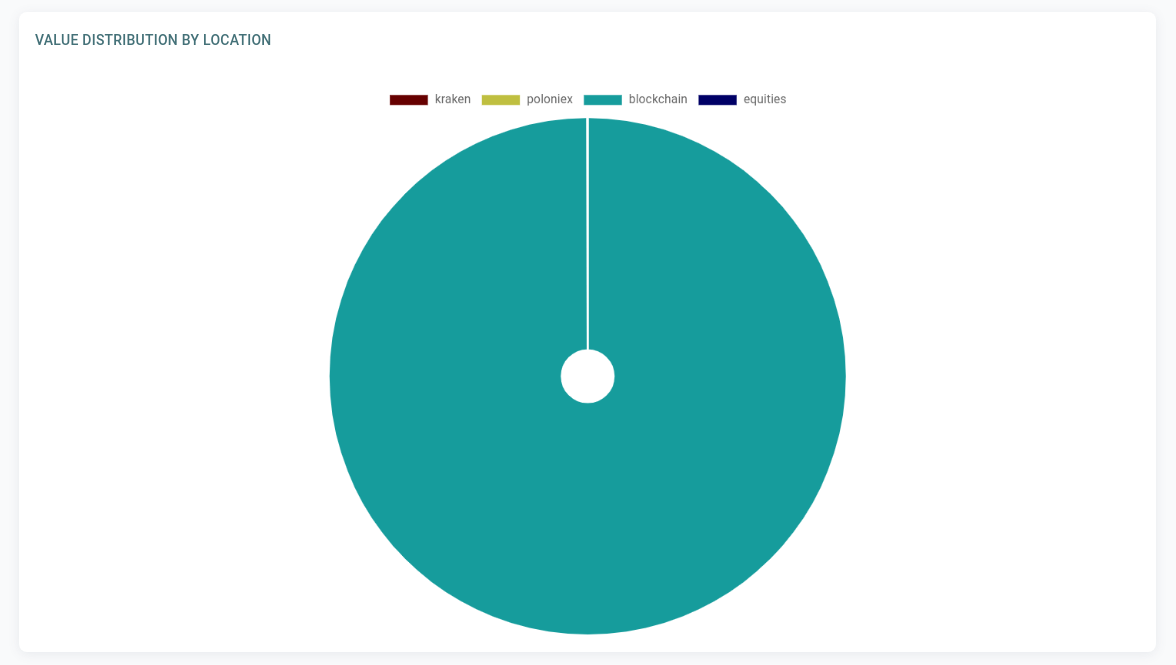
Value distribution by location
Furthermore, you can see a pie chart of the distribution of your net value across different locations. So you can determine how exposed you are to having a big part of your net value in exchanges, in banks e.t.c.
Value distribution by asset
Moreover, you can see a pie chart of the distribution of your net value across all the assets you own. This is an important analytics tool as it can help you determine your exposure on each asset and if some re-balancing of your portfolio is in order.
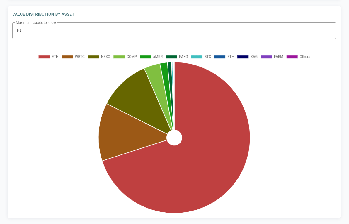
NOTE
The pie charts showing value distribution by location and asset use data from your latest snapshot, not your current balance. To see the most recent data, you'll need to create a new snapshot.
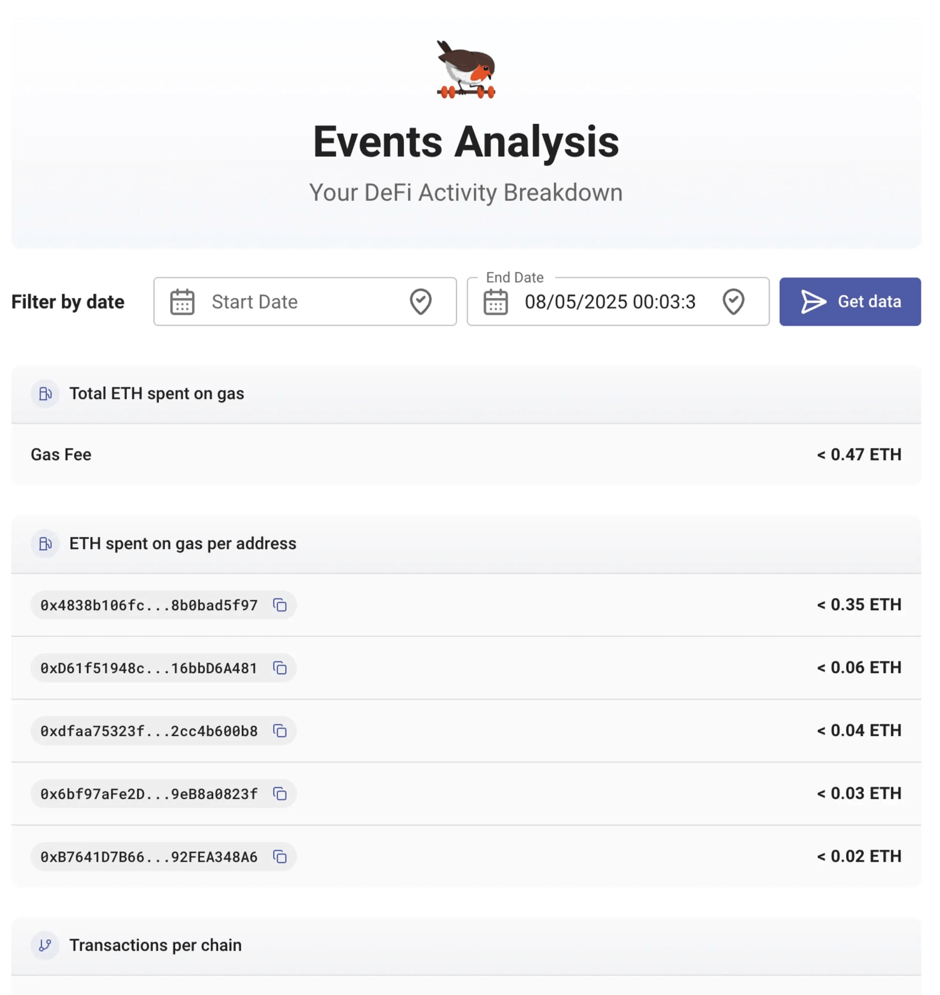
Event Analysis
It's available under the Statistic > Event Analysis menu. You can view the summary of your activities by checking your history events data, including ETH spent, exchanges/protocols used, and Gnosis Pay usage.